 Nearly a year ago we reported on changes at the United States Postal Service (USPS) that involved renaming some of its services and the introduction of a freshly-designed set of boxes, envelopes, and tubes that were received with a modestly encouraging response. More interesting than the final result was that we were having a conversation about design and USPS at all. At the time, I closed my first paragraph of that post with “No credit given” for who had designed those well-intentioned boxes. New York, NY-based GrandArmy recently posted a comprehensive page with their work for USPS that shows a large breadth of work to reposition the visual retail presence and in-store experience of more than 30,000 locations. Included in the scope of work was the redesign of the packaging which, as you will see at the end of the post, had a little more flair to it than what was finally produced by another vendor. To continue the unexpected conversation about design and USPS here is a look at what is basically a complete redesign of the USPS (sans logo).
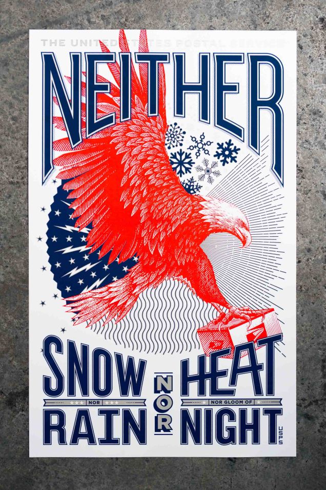
The United States Postal Service is one of America’s great infrastructure achievements. In addition to being a technical marvel, it is also a storied and hallowed institution. From the Pony Express to the first letters sent by air-mail, few things are so uniquely American.
Plagued by budget woes in the modern era — the USPS sought to modernize its image, and more importantly, streamline the retail experience with clear signage, way-finding and packaging.
USPS retail locations manage to be some of the first world’s most depressing “retail” experiences. They are drab, there are long lines, the clerks are rarely in a good mood, and there is too much information posted everywhere that makes little sense. Any small change that improves that experience would be a bonus. To the rescue: Gotham and a couple of condensed styles of Knockout. Perhaps a clear answer for us designers but, as GrandArmy tells me, it wasn’t an easy sell to USPS: “Typography was a big part of the discussions. We had to spend a while justifying our choices and petitioning for them to purchase the right fonts — but in the end they were reasonable. They appreciate good design and were happy we cared so much about their brand.”
New Retail Experience for USPS by GrandArmy